Case 01 · Master’s thesis
Redesigning a B2B website with a private client area
Research, information architecture, a prototype and testing so clients and staff can order, check and track status without a single call or email.
Date
March 2022 · Individual
My role
Research, design and evaluation
Tools
Figma, OptimalSort, Excel
Outcome
High-fidelity prototype, tested with 5 people
For confidentiality, I don’t name the company or show its brand.
Problem and context
A B2B services company with several branches across Spain had an outdated website that only listed a phone number and an email address. To request a quote, place an order, or check its status, clients had to call, write, or show up in person.
On top of that, some branches ran their own websites under different names, the information about services was ambiguous, and there was no distinction between clients and staff, who used the same site as their point of reference.
Goal: redesign the site so clients and staff can place orders, request quotes and check their status without calls or emails, distinguishing between branches and user types.
Research and findings
Contextual inquiry (about 3 months)
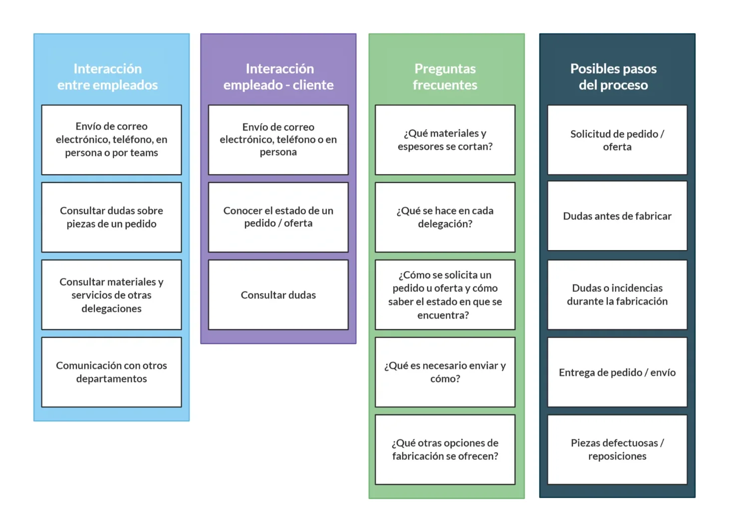
I observed and interviewed order-management, sales and technical-office staff, plus different types of clients (large companies, small businesses and individuals), in person, online and by phone. I organised what I learned into an affinity diagram.
Finding: communication between staff and clients revolves around the same questions, mostly order status and issues, information that couldn’t be checked online.
Benchmarking and heuristic evaluation
I analysed 5 websites in the sector, including the company’s own. Only one offered proper online ordering, with many requirements and no post-order features. The private areas of the rest couldn’t be analysed.
I evaluated the current site against 11 Nielsen-based heuristics. Among other issues, I found no breadcrumbs, error messages with no suggestions (shown in the wrong language), and no help or FAQ section.
Online survey
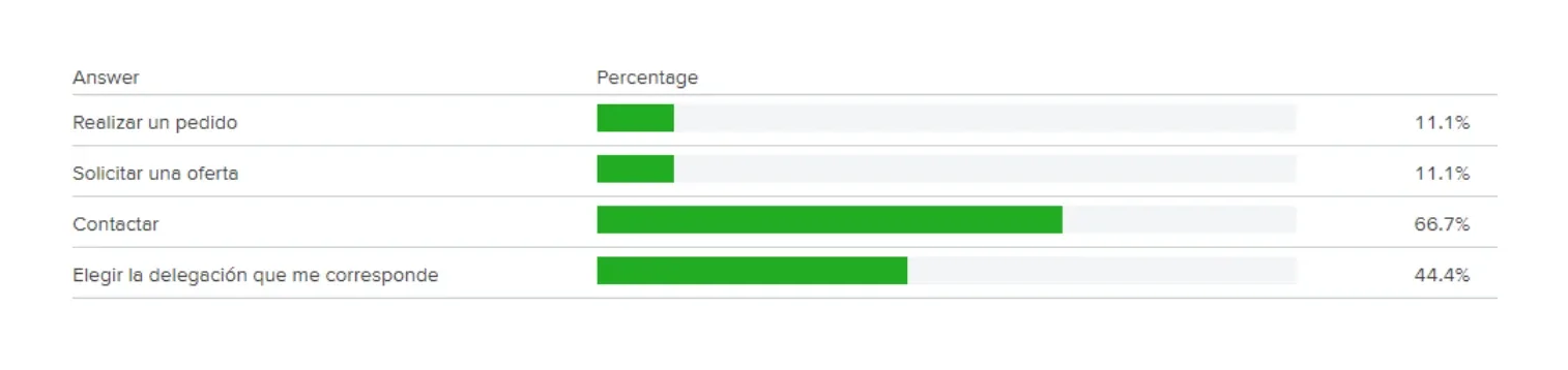
With 9 responses, everyone surveyed ordered online occasionally and wanted to track status. Testing the current site, only 1 in 9 could figure out how to place an order or request a quote, and 6 in 9 could find how to get in touch.
Open card sorting
With OptimalSort (10 participants, 20 cards) I found that nobody created more than 4 groups, and they preferred generic, jargon-free names. From that I defined 5 groups for the new structure: Materials, Services, Account access, Help and About us.
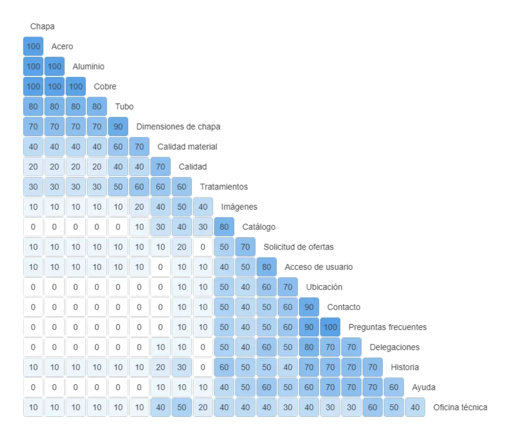
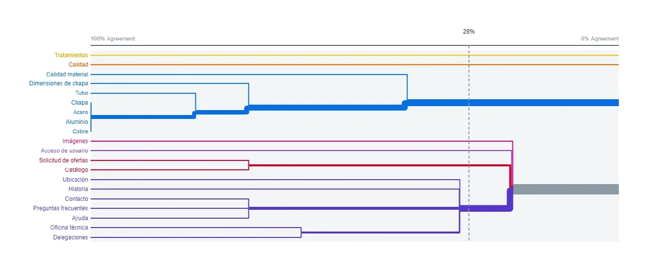
I also built a content inventory in Excel to decide what to keep and what to drop, and with everything above I defined 5 buyer personas (3 clients, 2 staff) to guide the design decisions.
Design process
Information architecture
I defined a sitemap with Home, Materials, Services, Company, Help, and a private-area entry point split between client and staff. The homepage asks for the user’s location to route them to the right branch and offers ordering or requesting a quote directly.
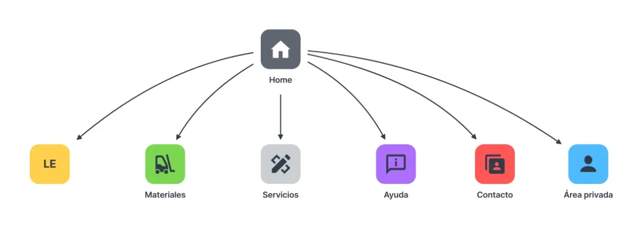
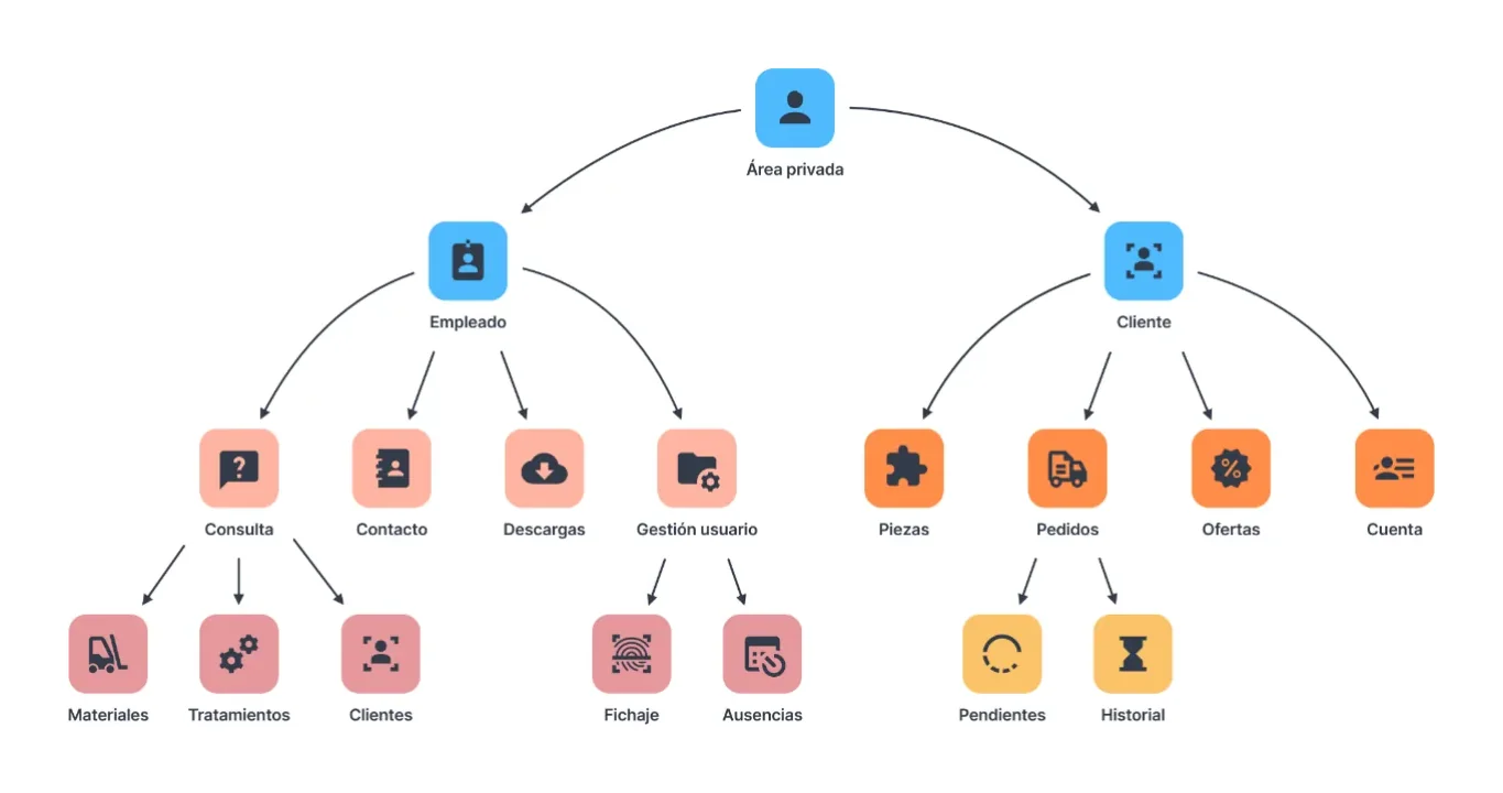
Sketches, wireframes and design system
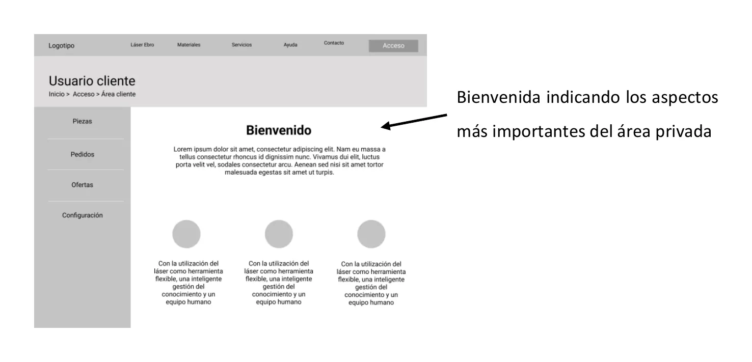
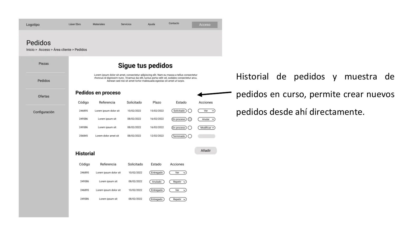
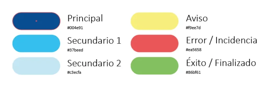
I sketched and annotated wireframes in Figma for every key screen, explaining what each element should do. Then I defined a corporate and semantic palette (warning, error, success), typefaces (Oswald for headings and buttons, Merriweather Light for body text), and button and table styles.
Final solution
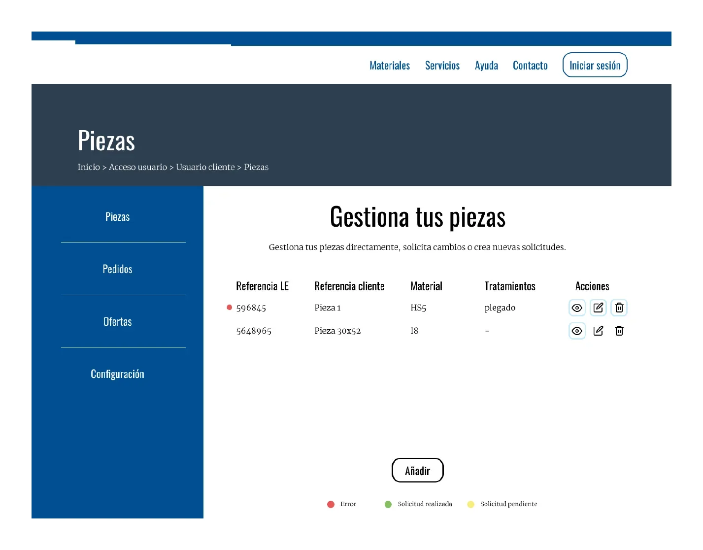
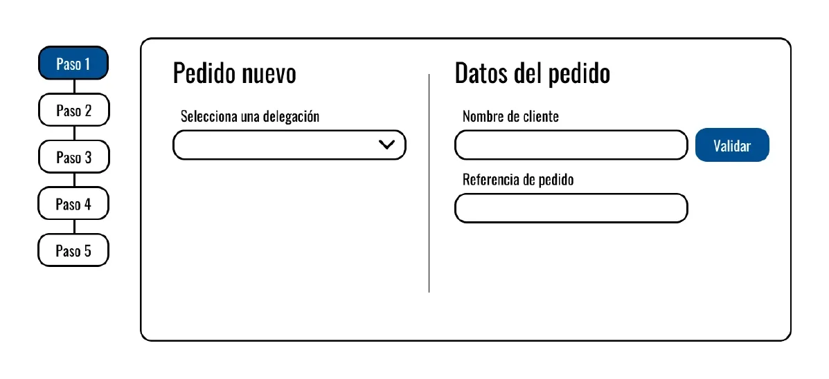
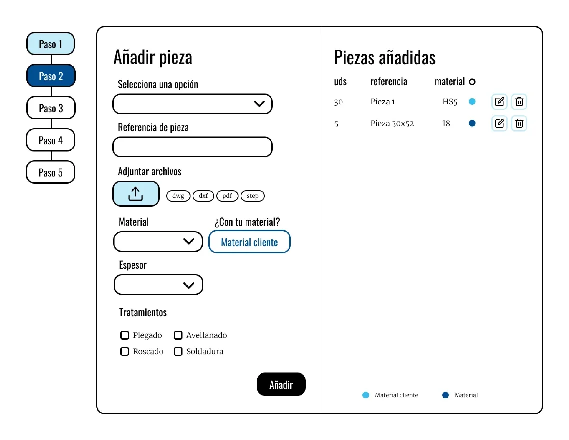
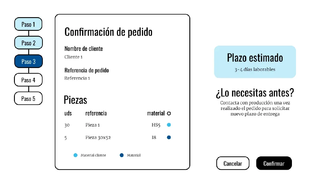
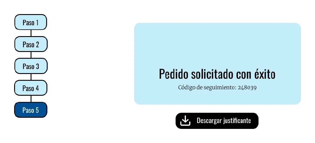
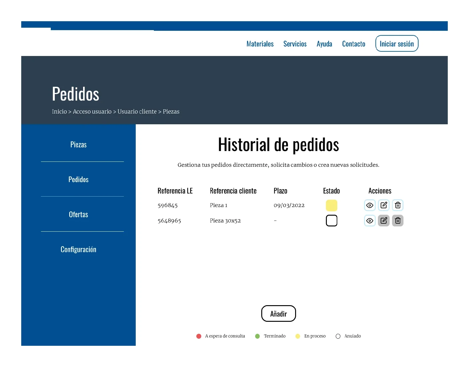
A high-fidelity interactive Figma prototype with a 5-step order flow (with confirmation and estimated delivery date), FAQ and downloadable guides, a contact form split by department and branch, and a client private area with order history and parts management.
User testing
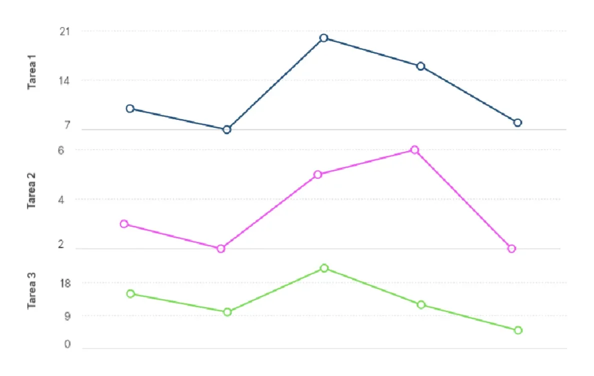
I tested the prototype with 5 people representing the user base, with 3 tasks of up to 15 minutes each: placing an order, sending an enquiry to the admin department, and checking order status to cancel one.
What I found
- The part-code field confused new clients.
- In “My orders”, informational areas were mistaken for buttons.
- On the contact form, some people thought the email/phone requested was the company’s, not their own.
- When ordering, people went for the email-request option before “continue without an account”.
- Opening hours and the matching branch went unnoticed.
- To check order status, some people went to Services instead of their profile.
- In one case the cancel-order task wasn’t completed, and times were longer for people less familiar with technology.
To revisit in the next iteration: adapt quote and order requests to real users, show order status at a glance, detail the flow for guest users, and make branch opening hours more visible.
Results and takeaways
This work is the first iteration of a cyclical process. The test results stand as hypotheses to validate in further rounds, which is why I don’t include impact metrics.
What I take from it: researching in the real environment surfaces needs that users don’t put into words because they take them for granted. And the project opens up a wide field to explore in online ordering for B2B services.
Defined next steps: flesh out the client and staff areas, add online payments, link existing data to user accounts, and move into development.
My contribution
Individual project: I carried out all the research, design and evaluation myself, drawing on direct access to staff and clients for the contextual inquiry.
Next case