Case 02 · UX design internship
Hackin School: a tech-education platform
Designing the website and student area of a tech-education school, from strategy to prototype, with prioritised requirements and a roadmap.
2021 · Internship at Interacso · Team of 3 UX/UI designers (my role: UX/UI designer) · Figma
4
Scrum sprints
7
weeks of work
9
design requirements defined
4
value propositions
01 · Context
A platform to learn and grow in tech
Hackin School is a tech-education school that needed a web platform where students could choose programmes, track their progress and understand the industry’s demand for skills.
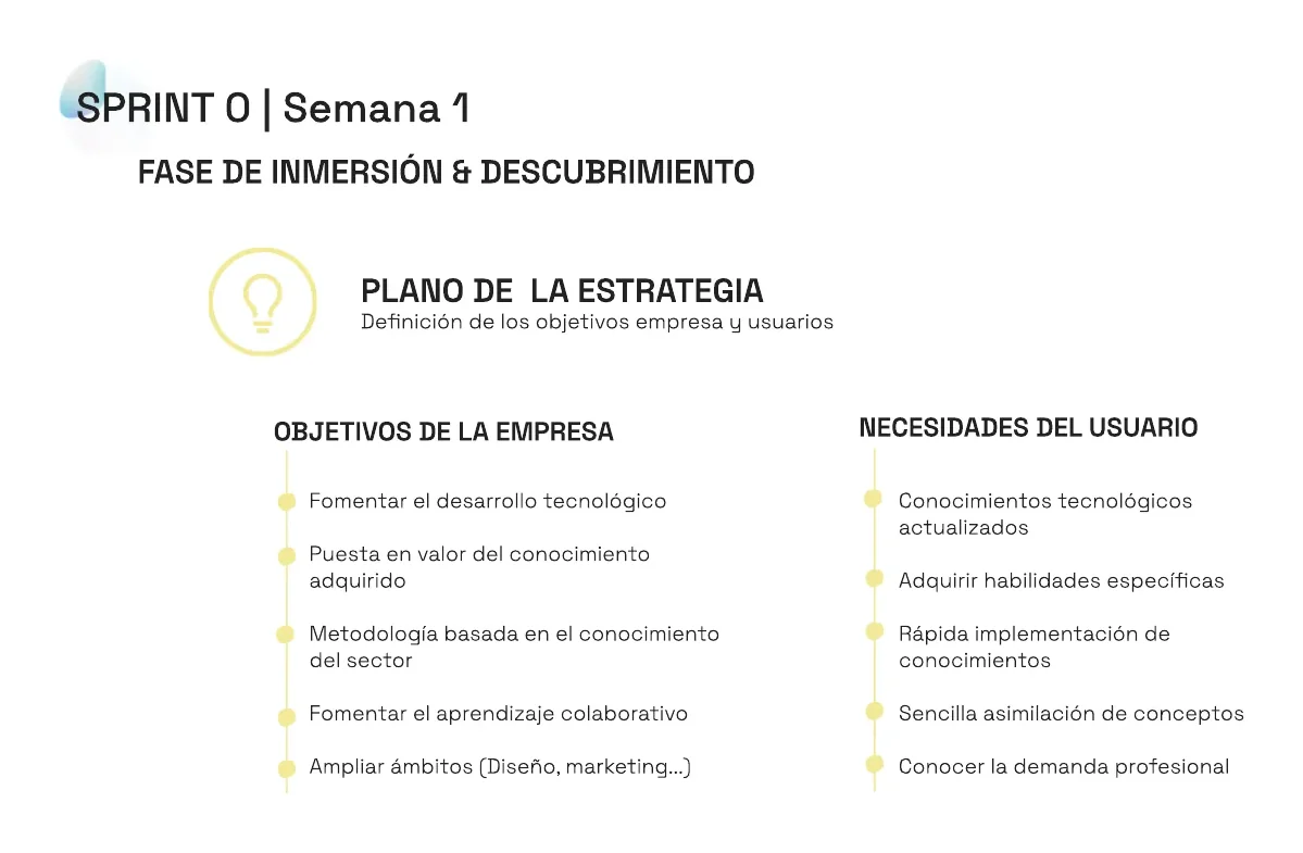
We first defined the company’s goals (drive tech development, showcase acquired knowledge, encourage collaborative learning, and expand into fields like design or marketing) and the users’ needs (up-to-date knowledge, specific skills, quick application and easy-to-grasp concepts).
02 · Method
How we organised the work
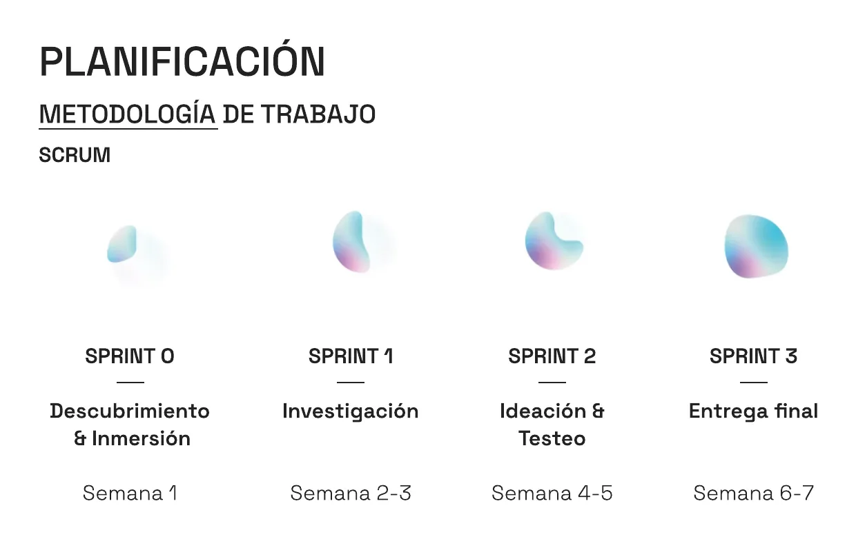
Scrum in 4 sprints
Discovery and immersion, research, ideation and testing, and final delivery, spread across 7 weeks.
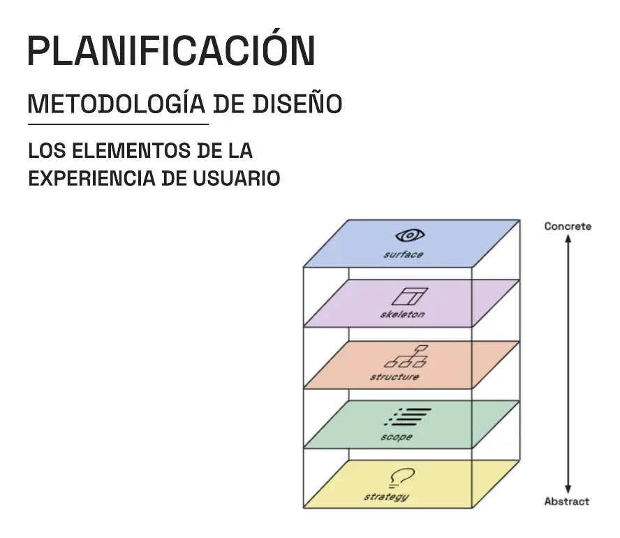
Five planes of experience
We structured the design using the five planes of user experience: strategy, scope, structure, skeleton and surface. Each sprint tackled one or two planes, moving from the most abstract to the most concrete.
03 · Research
From problem to requirements
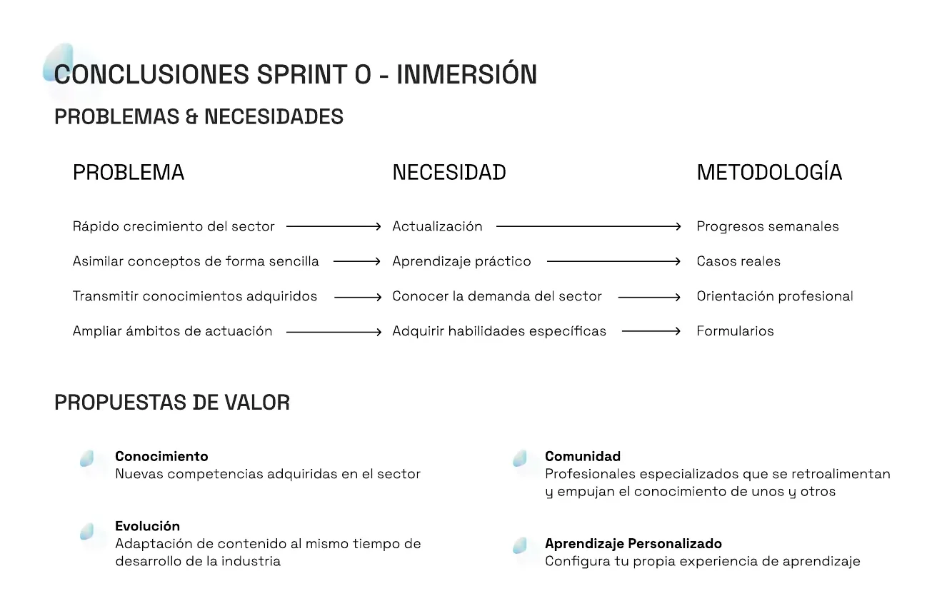
Problem, need, method
In sprints 0 and 1 we linked each problem to a need and a way of working. Fast growth in the sector demands staying current, which we answer with weekly progress; grasping concepts easily demands hands-on learning, which we answer with real cases.
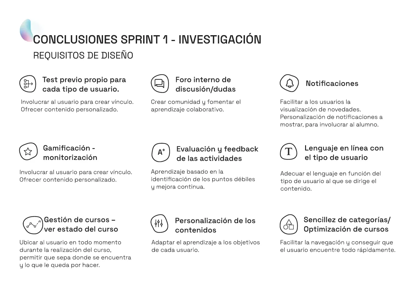
4 value propositions, 9 requirements
Knowledge, community, evolution and personalised learning. Among the requirements: a placement test per user type, an internal forum, customisable notifications, gamification, feedback on activities, course-status tracking and simple category navigation.
04 · Design
From structure to prioritisation
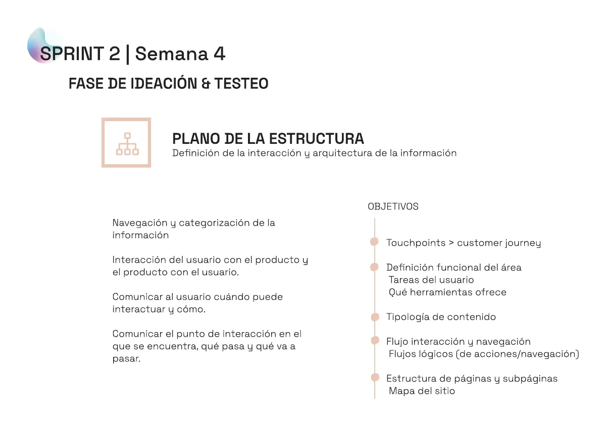
Structure and skeleton
We defined the touchpoints and user journey, the tasks for each area, the content types and the navigation flows. Then we nailed down the navigation and interface elements.
MoSCoW prioritisation
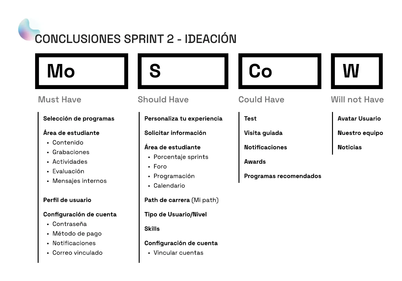
We sorted the features into must-haves (course selection, student area, profile and account settings), should-haves (personalisation, career path, skills), could-haves (placement test, guided tour, awards) and won’t-haves for now (avatar, team, news).
05 · Solution
The prototype, screen by screen
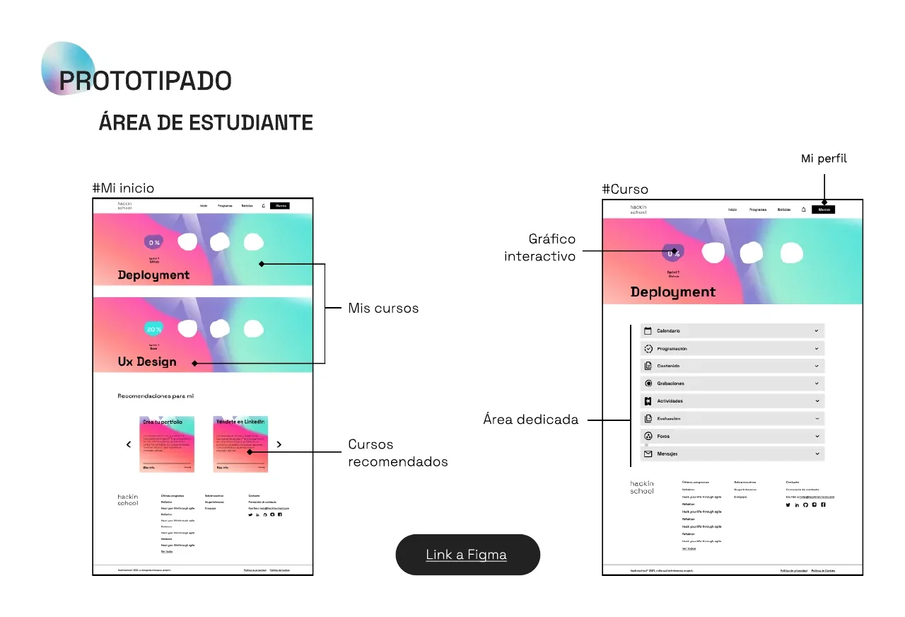
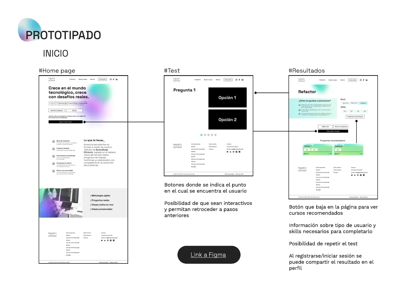
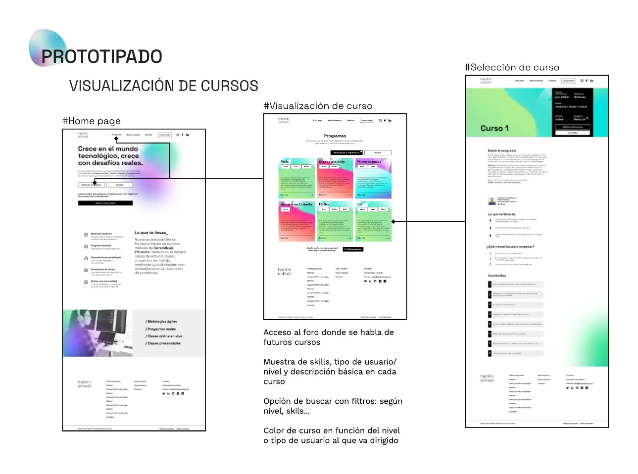
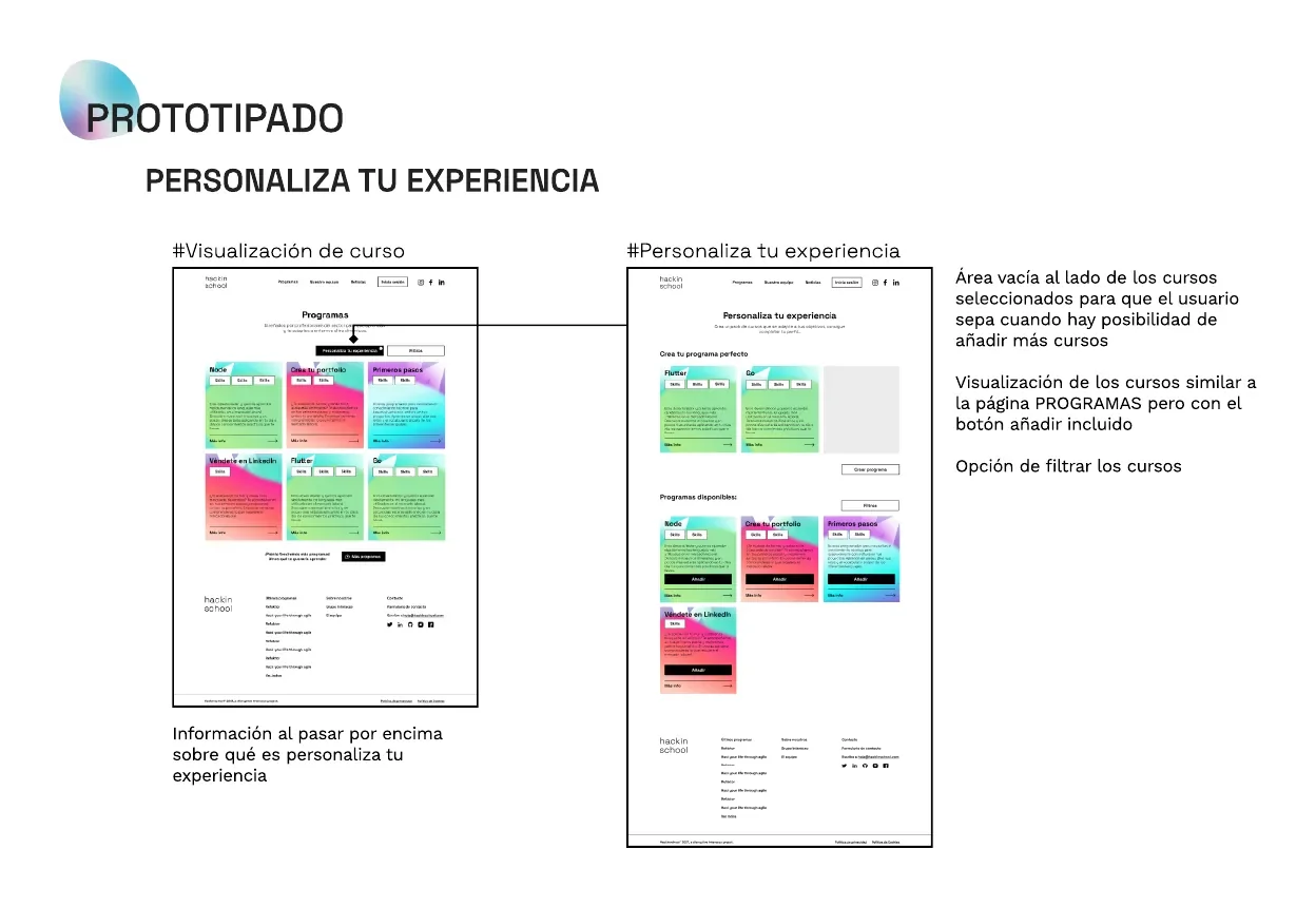
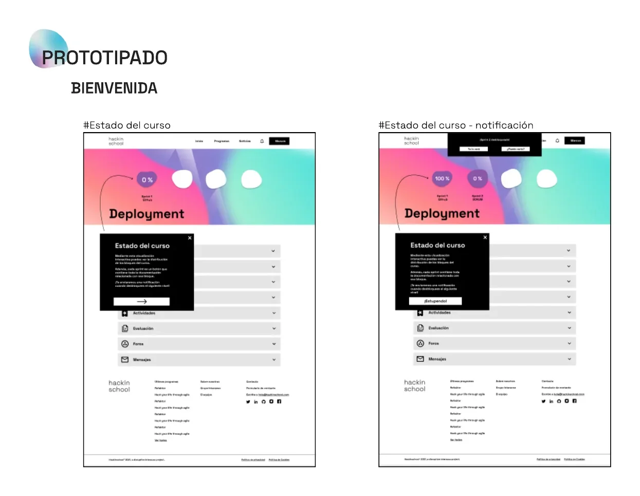
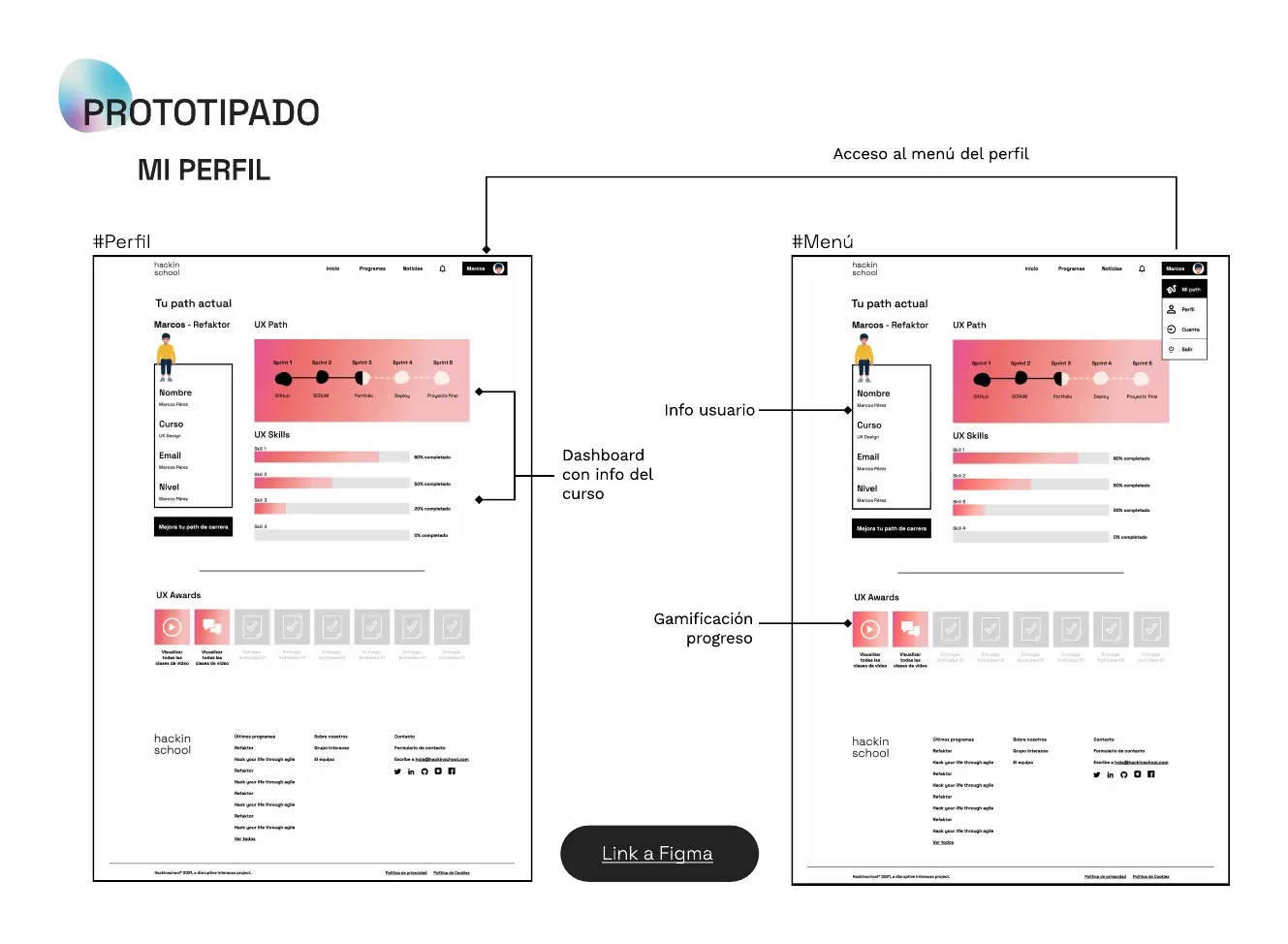
A low-fidelity Figma prototype: a placement test that recommends programmes, a course catalogue with level and skill filters, building a custom programme, a student area with sprint progress, a guided welcome tour, and a profile with career path.
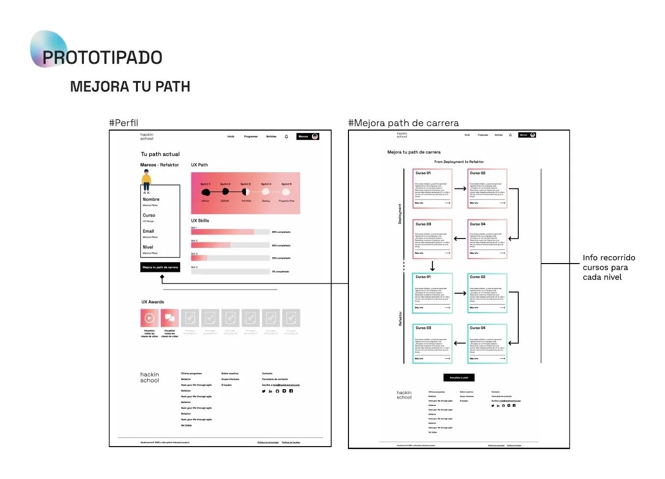
Improve your path
A course roadmap by level that shows students what to study next to move forward in their career.
06 · Wrap-up
Results and takeaways
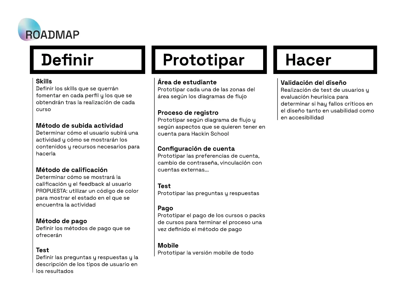
The project ended with a low-fidelity prototype and a three-part roadmap: define (skills, how activities are submitted and graded, payment methods and the test), prototype (student area, sign-up, account settings, payment and mobile version), and validate the design through user testing and heuristic evaluation, including accessibility. That validation was planned as the next step.
My contribution
I worked as a UX/UI designer in a team of three designers, alongside my two teammates.
Next case