Method exercises · Master’s degree
UX Lab
Short exercises where I practised different research and evaluation techniques. They analyse real websites and products for academic purposes and aren’t affiliated with the brands mentioned.
6
exercises, each with a different technique
12
criteria in the fitness-tracker benchmark
3
evaluators in the heuristic evaluation
4
WCAG principles in the accessibility audit
01 · Individual · Comparative analysis · IoT
Fitness-tracker benchmarking
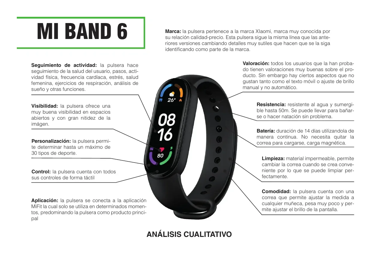
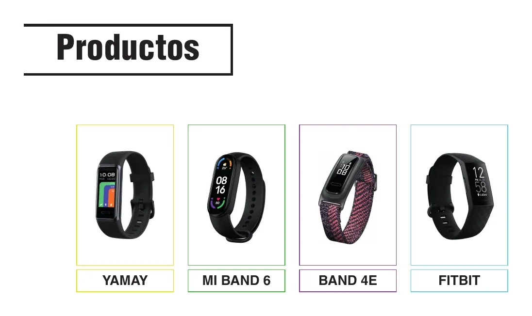
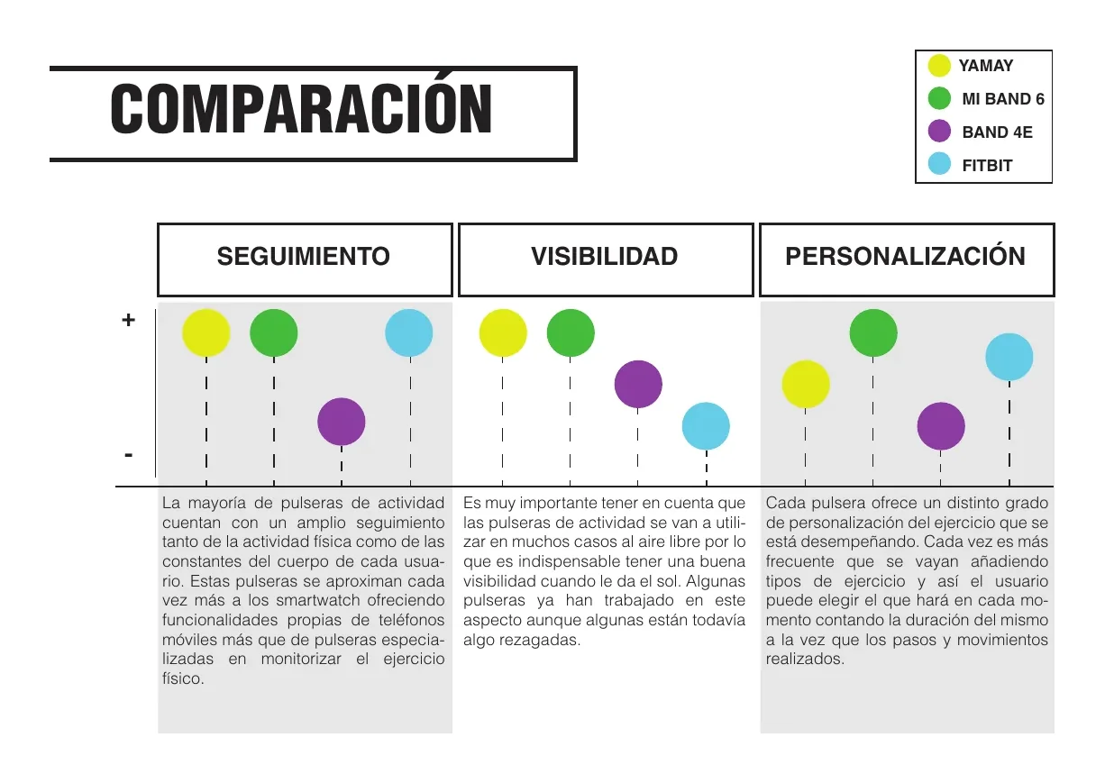
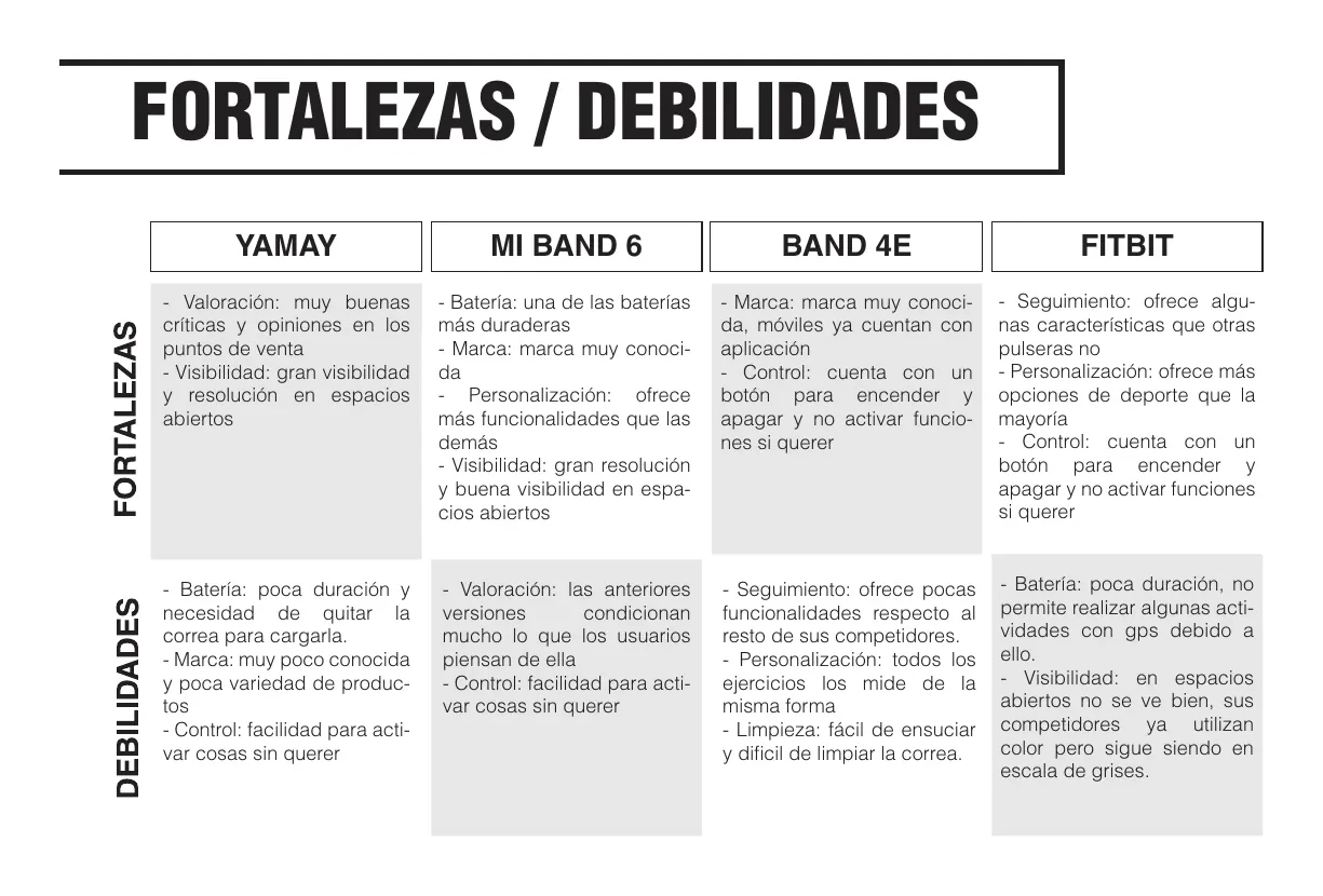
I compared 4 fitness trackers (Yamay, Mi Band 6, Huawei Band 4E and Fitbit Charge 4) against 12 criteria: tracking, screen visibility, personalisation, controls, app, comfort, cleaning, battery, brand image, popularity, user ratings and durability. I ran a qualitative and quantitative analysis of each product.
Proposed requirements: configurable tracking to save battery, automatic brightness, button-based lock, a waterproof strap that doesn’t need removing to charge, and a look that stands out from the crowd.
02 · Individual · Customer journey · Hypotheses
Customer journey map for an online supermarket
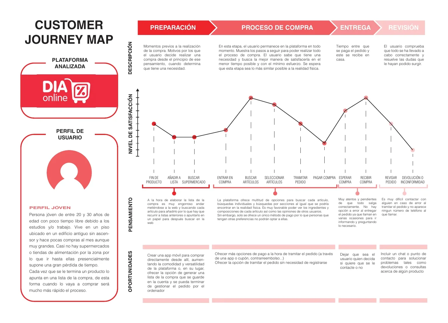
I walked through the full purchase process on an online supermarket and checked forums and blogs for the final stages. I started from hypotheses, tested them against studies, and defined a young, time-poor user profile. The map covers four stages (preparation, purchase process, delivery and review) with a satisfaction curve.
Pain points
A single payment method, a shopping list that’s tedious to build, and difficulty getting in touch over an error or a return.
Opportunities
A mobile app or a saved list in the account, more payment methods, guest checkout, and a contact chat.
03 · Team project with Andrea Martínez Tejada and Ibone Bilbao Toucet · Heuristic evaluation
Heuristic evaluation and a UCD work plan
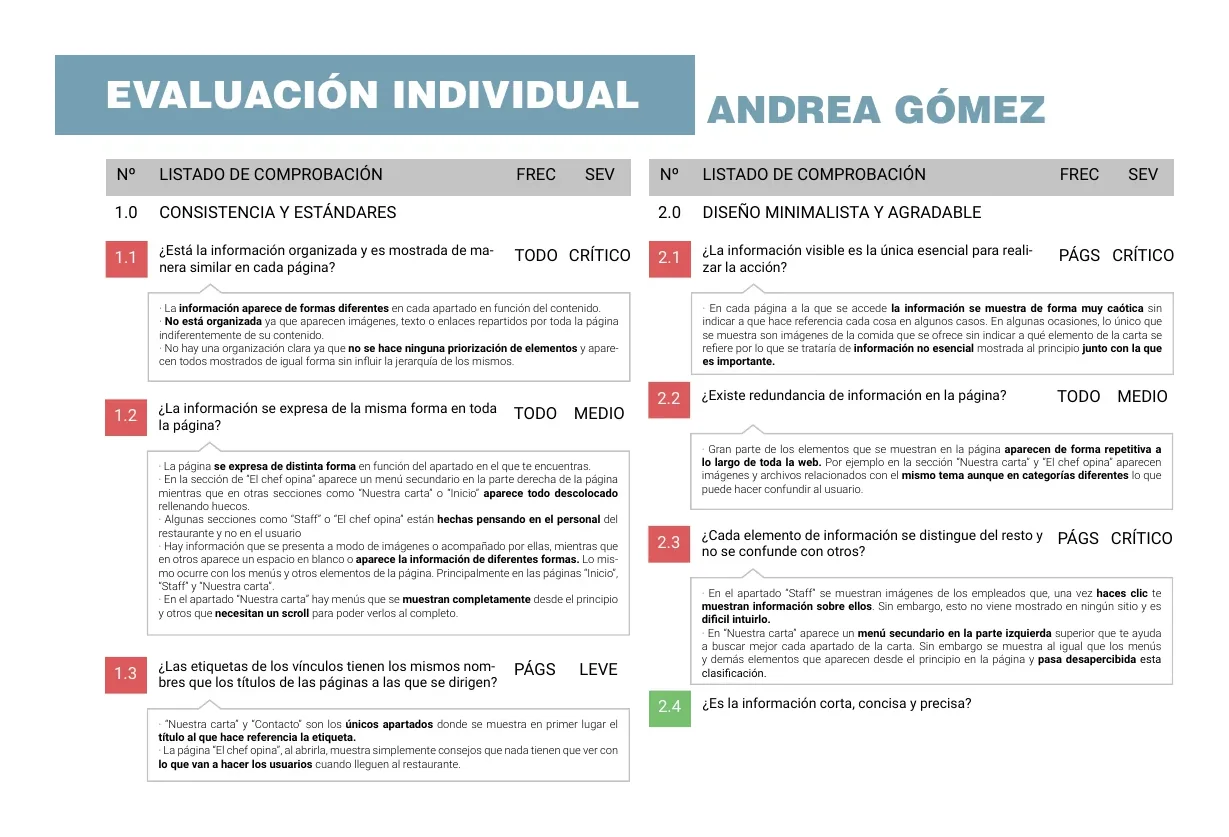
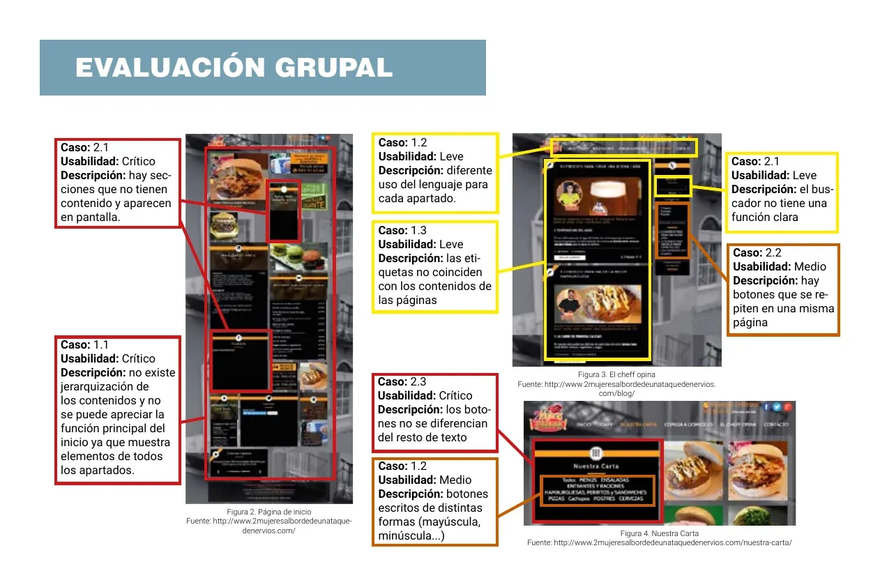
We evaluated a restaurant’s website against two heuristic principles (consistency and standards, and minimalist, pleasant design) with frequency and severity ratings. Each of us evaluated independently, then we merged the results.
Findings: the homepage had no hierarchy, some empty sections were visible, and buttons weren’t distinguishable from plain text.
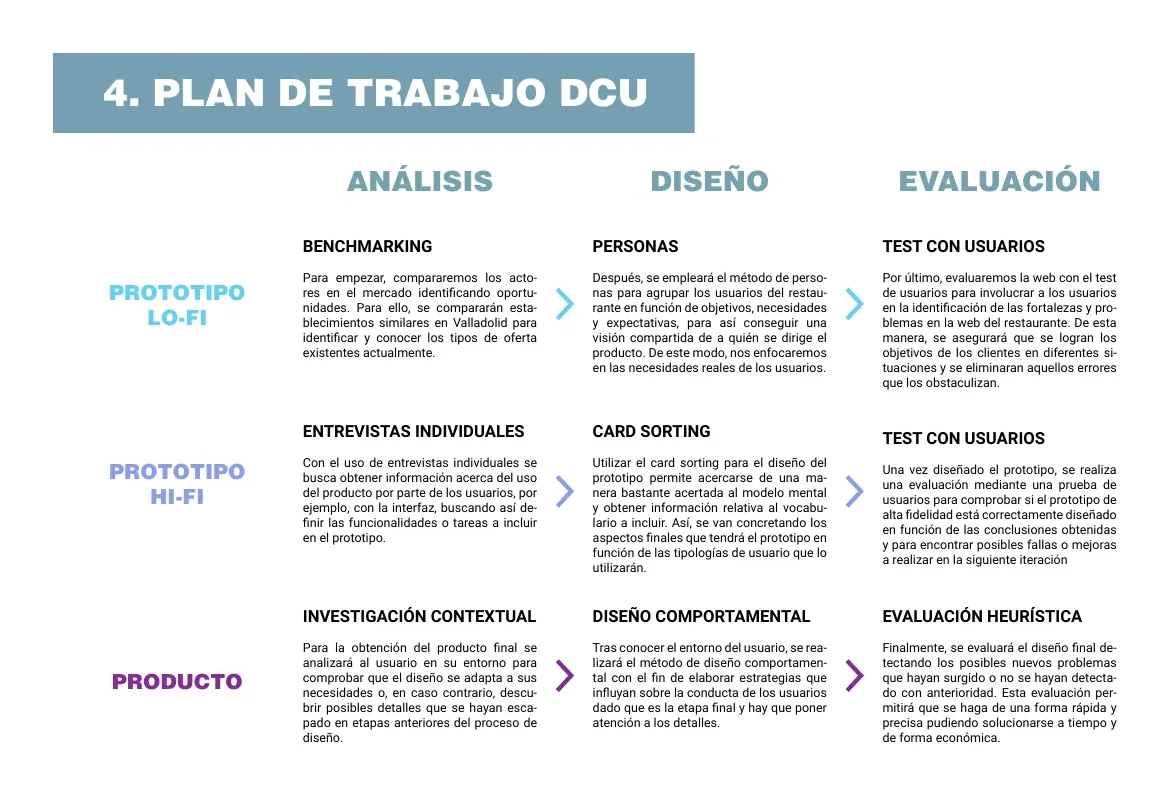
We wrapped up with recommendations and a three-iteration UCD work plan (low fidelity, high fidelity and product) with a timeline.
04 · Team project with Andrea Martínez Tejada and Ibone Bilbao Toucet · WCAG
Web accessibility audit
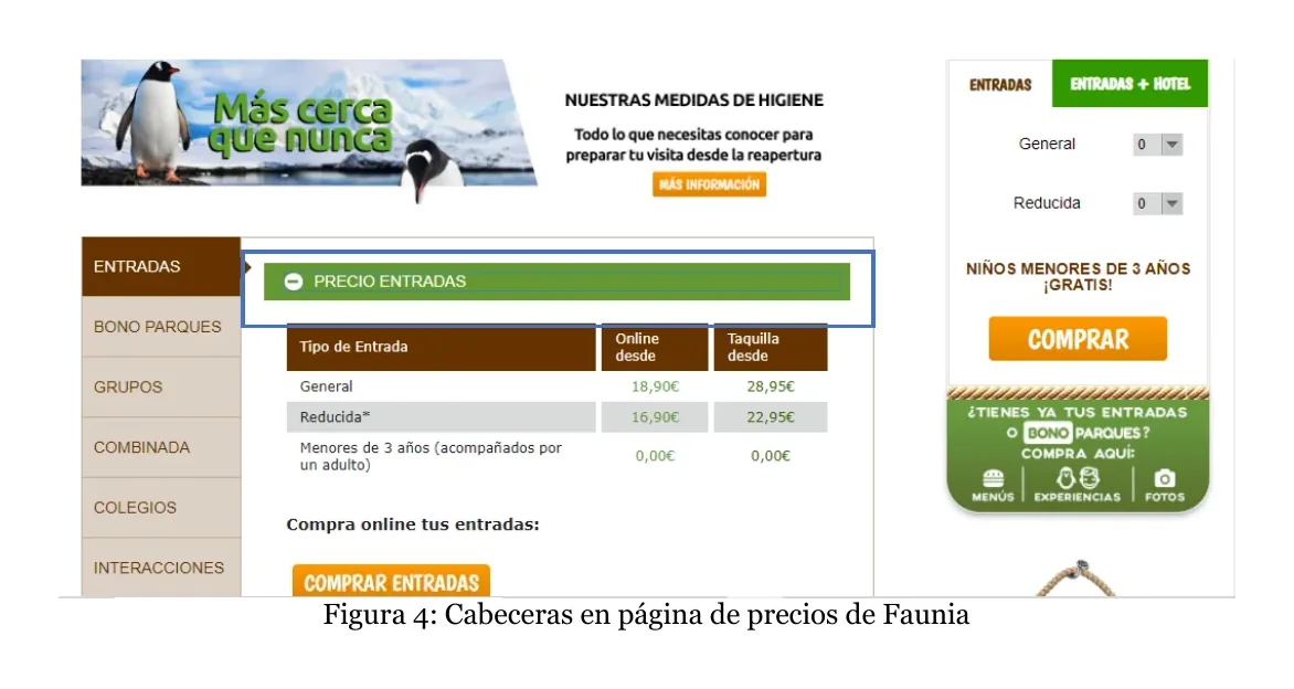
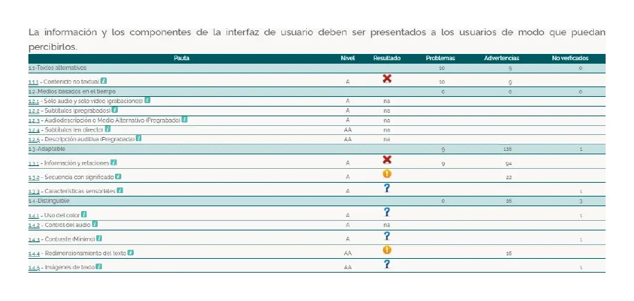
We audited a zoo’s website with blind users in mind, combining a manual review (alt text, keyboard navigation, headings, tables, lists, forms, styles disabled) with an automated one using TAW against the four WCAG principles.
We found: unhelpful alt text on the logo, form fields with no associated label, a pricing table with no summary, and social-media links with no accessible content.
05 · Team project with Andrea Martínez Tejada and Ibone Bilbao Toucet · Navigation
Information architecture and navigation systems
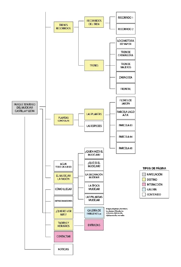
We mapped the structure of a theme park’s website and analysed its menus, pagination, navigation bars and buttons.
Proposals: a single horizontal menu with dropdowns, consistent wording, breadcrumbs and a back button on all second-level pages, a gallery that doesn’t take you off the page, and a mobile-friendly layout.
06 · Individual · Excel
Content inventory
I catalogued every page of a commercial website in Excel, with levels, descriptions, content, actions, source, notes and URL.
Findings: a lot of repeated content, internal and external links not distinguished from each other, overlapping menu sections, and a news section untouched for over a year.